Work with fixed blue bathroom tile through a clear secondary palette
Fixed blue tile can remain the defining field in a bathroom while towels, storage objects and other movable details create a more deliberate style. Begin with the actual tile color and pattern, then choose a limited secondary relationship. The study does not require replacing a sound fixed finish.
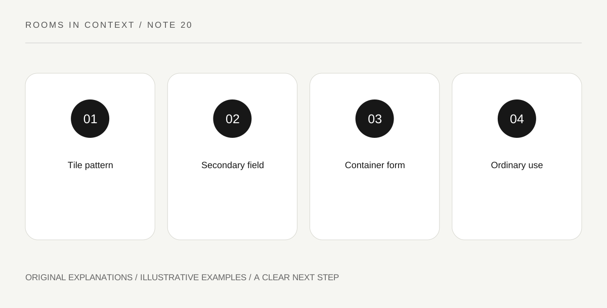
Original explanatory diagram. Read the full method and limitations below.
Read tile, grout and fixtures together
Observe the blue beside grout, sanitary fixtures, floor and existing metal finishes. A blue tile with white grout creates a different pattern from the same tile with a close-colored joint. Note whether the field feels calm, gridded or strongly patterned. A tiny isolated sample may hide the repetition across the whole wall. Start with the room’s actual combined surface rather than a color name taken from a mood board.
Choose a secondary field with enough area
Towels or another suitable textile can provide a visible companion. A warm pale shade may soften the contrast; a crisp white may make the grid clearer. Compare actual samples under the bathroom’s ordinary light. The goal is a relationship you prefer, not a promise that one accent will neutralize blue. A tiny decorative object may not contribute enough area to change a large tiled field, even if its color is attractive.
Use containers as a repeated form
A small group of suitable containers can repeat one simple shape or finish. Keep the actual daily products available and follow appropriate storage requirements. You do not need to decant every product into identical bottles to achieve coherence, especially when that would lose useful labels or instructions. A tray or quiet surrounding field can relate varied packages without pretending they are the same object. Choose what is practical for the household.
Keep wet-area suitability separate from appearance
Objects, textiles, mounting and any finish treatment need to be appropriate to the actual bathroom conditions. Do not attach or coat materials solely because a styling photograph shows a similar effect. Obtain suitable guidance and permission for changes to fixed surfaces. The decorative plan can remain a reversible palette study: blue field, secondary textile and repeated container form. Review the room after ordinary use to see whether the relationship remains clear when the daily items return.
Illustrative worked example
Illustrative bathroom: Medium-blue tiles with a strong white grid remain in place. The reader compares bright-white towels with warm pale ones and prefers the quieter warm relationship. She uses one simple container shape for appropriate loose items while leaving labeled products intact. She avoids an adhesive decorative treatment because the palette study already gives the fixed tile a clear role without altering the wet-area surface.
Questions that come up
Must blue tile lead to a nautical theme?
No. A color does not prescribe a motif. A clear secondary palette and simple forms can create a different interpretation.
Should every product be decanted for a consistent look?
No. Original labels and packaging can carry important use information. Visual coherence can come from the surrounding arrangement while products remain identifiable.
References and scope
These sources support the factual background. Examples and exercises are original illustrative teaching material. References do not imply endorsement.
- V&A Furniture collection — Primary reference objects for studying furniture forms, construction and material relationships.